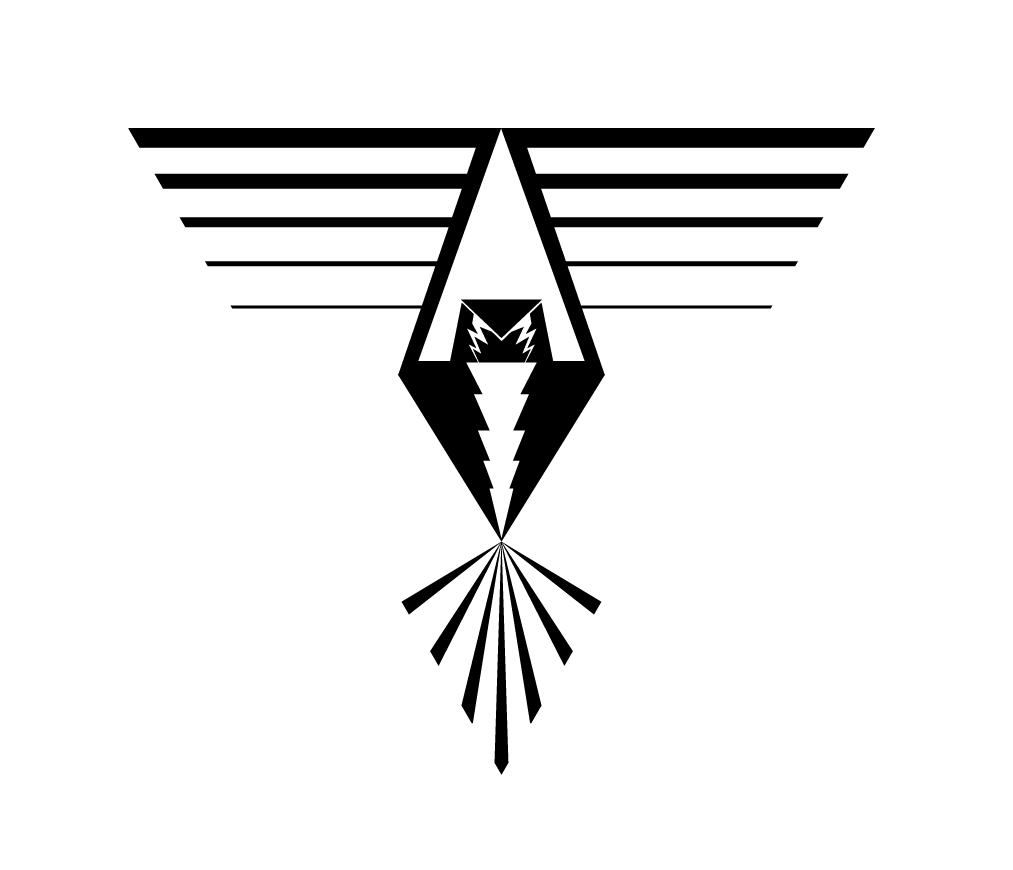
I’ve been going through some older files and I stumbled across a second version of my triangular thunderbird design. It definitely has a much different feeling than the other version. I feel like having the triangle pointed down here tends to ground the piece whereas the other version has a triangle pointing up which helps with lift. There are things I like and things I don’t in this piece. I think the variation of line is interesting. I find this version more traditional compared to the other which, to me, seems more like a modern take on a traditional arrangement. I’m not in love with how the head and chest look but it was a challenge to get a front facing view to look correct.