
I had a logo design job a few years ago and it was a process to say the least. These are some of the designs I came up with that they did not go with. This was for an LGBTQ+ group hence the rainbow color scheme. Just a quick run-through.
- This one was a little goofy but the group’s name is “perceptions” so I thought the glasses were a funny nod to that idea. I still kinda like it.
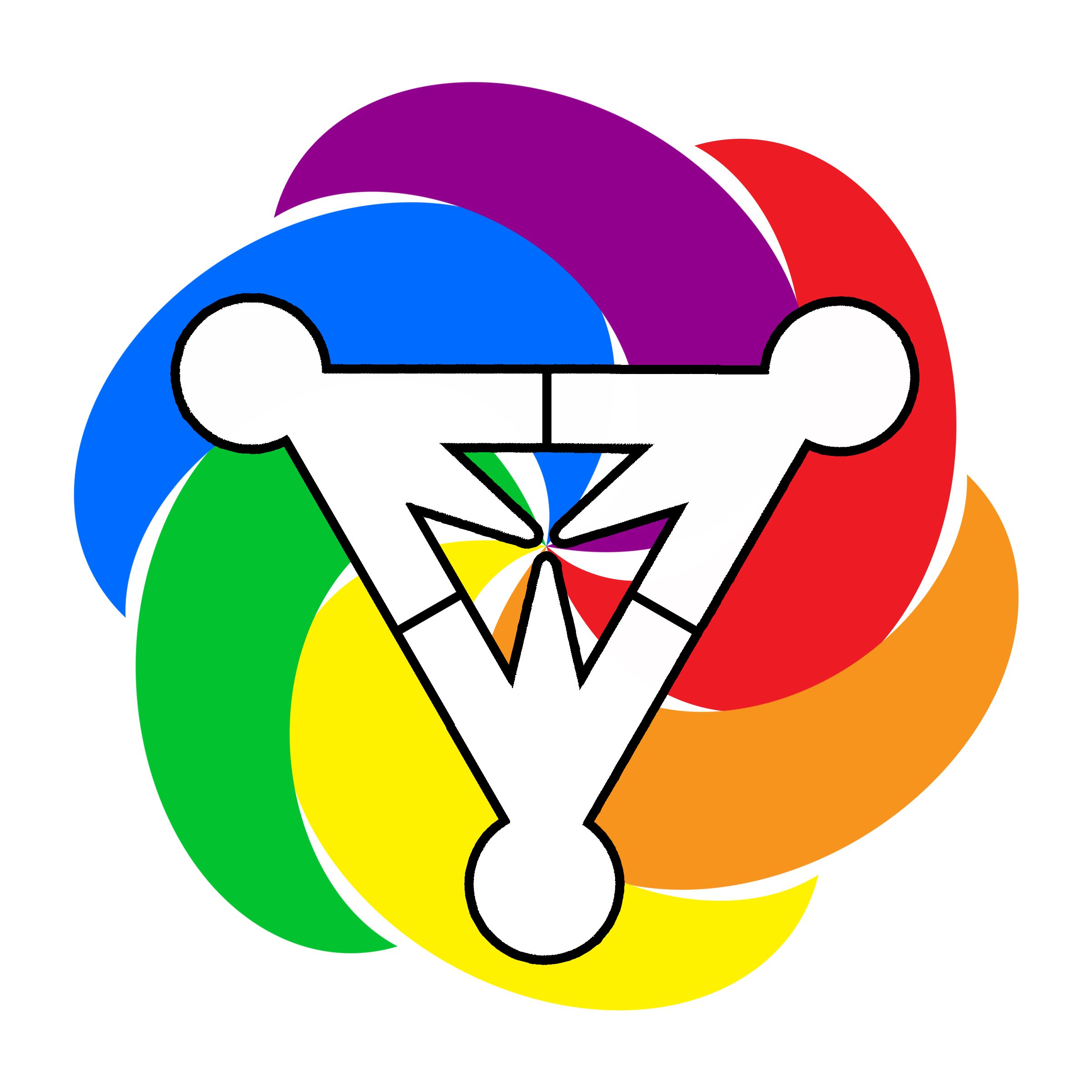
- This one came about after a consultation and hearing they wanted something that conveyed movement. So I made some swirly madness. The people in the middle formed a triangle as a nod to the pink and black triangle motif used most notably during the Holocaust to identify lesbian and gay prisoners respectively. The group wasn’t into all the people being “white” and I totally agree. The issue however was that there was already A LOT of color happening and adding in different skin tones and what not just looked too chaotic. I have versions of this design using just black or pink, blue, and purple but none of the alternates looked better. So this idea got scrapped.
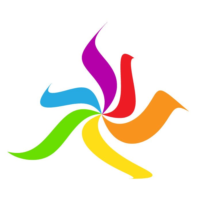
- From here, I decided to go really abstract because I obviously just was not understanding what the group was looking for so I just played around with that spiral shape and warped the slices into something aesthetically pleasing. They responded favorably to this so I moved forward from here.
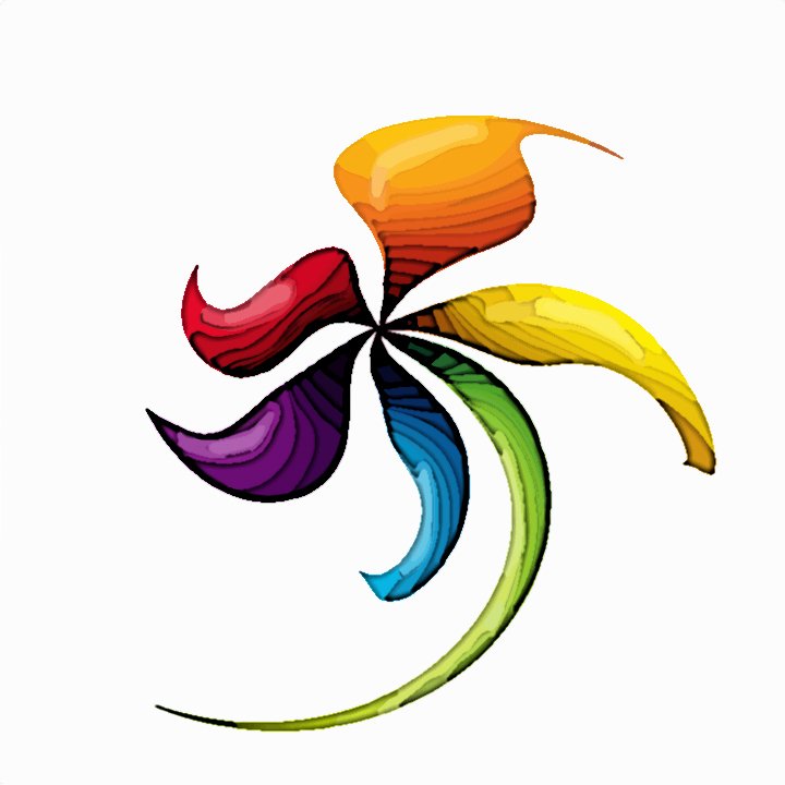
- The abstract spiral evolved into a flower. I tried to sell a narrative that flowers have both male and female parts to reproduce. They represent growth and often struggle through adversity to go from something humble like a seed to something fantastic like a flower. This was one of the final two designs for the group to pick from and it was apparently a little too similar to another local business’ logo.
At the end of the project, I was happy with the logo they chose and I think it is a great symbol for their group.
Like the Pride Glasses design? Want to buy a t-shirt or print of it? Click here to go to my shop!