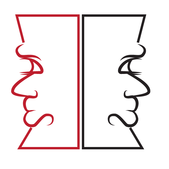
Another design job that didn’t end up being picked up but that I thought was still kind of interesting. An acquaintance of mine had expressed interest in getting a logo for a business venture of his and so I told him I’d draw up some ideas and see what he thought. He wanted to use the name Janus and also include the color red in there. So I did a little research about Janus to get some ideas. Janus was the Roman god of beginnings, doorways, gates, endings, etc… He was usually depicted with two faces; one to view the past and the other to view the future.
SO, going off of these things I came up with the designs above. The first was a very straightforward approach of depicting the two faces. My twist to give it some interest was to use the letters of his name to make the face profile. So if you view the left side of his face and turn it on its side, you will see the word “JANUS” stylized of course to make the desired shape.
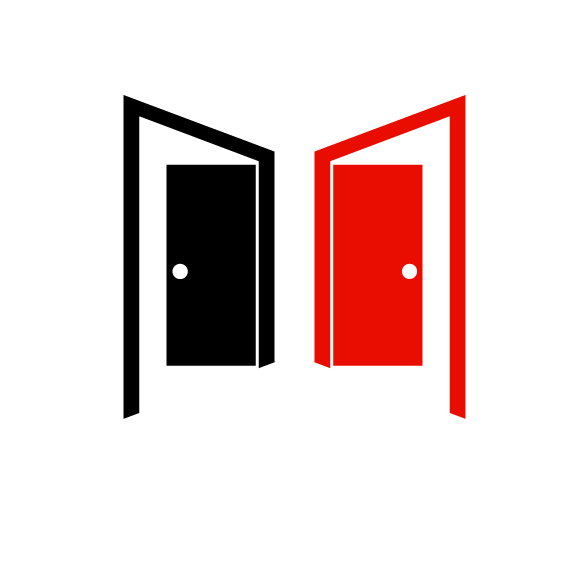
The second version was a very simple take using the concept of a doorway. I thought of that old saying that is basically “when one door closes, another opens”. You see both doors half ajar or half shut depending on how you look at it. I just find something really clean and effective about this version that really satisfies my eye.
Unfortunately, this project never went further but I’m pleased with my ideas and I valued the practice.